How to Generate More Orders on Your Restaurant’s Website?
Did you know that ordering online isn’t just a luxury but a necessity nowadays? The goal of setting up your restaurant website is not only for increasing brand awareness, but also for your restaurant to generate more orders. Why? This is to convert traffic and audience into paying customers when they learn about your latest offering or be intrigued by your technology – say, an online ordering system.
Establishing your restaurant’s online presence is one thing, but generating additional revenue from this stream is another. Wouldn’t if be awesome to get the best of both worlds? Check out these key factors that contribute to generating more orders from your website:
Engaging website
Remember, you’re trying to offer a great ordering experience even online. Traffic is generated by how your website looks. Is it visually appealing? Is it engaging? The way your website looks speaks loudly of your brand, your product, and services. So, your website will do well to look professional, but not boring. Therefore, your customers have to get a feel of what dining at your place, or trying out your menu, is like. They should feel the need to satiate their hunger with your offering.
Below are three things to consider when planning your website:
- Design
First impressions last, they say. And to drive traffic to your website, your ideal customers must be attracted to it. Why? For the simple reason that the way, your website intrigues your customers will most likely depend on what they see on your website. The way your website is arranged and feels as they browse will matter.
So make your website stand out from the rest.
Your website design must be user-friendly and the experience it gives to your customer is superior. You can consult or hire a User Interface and User Experience Designer to help you in attaining this goal. It’s very important that your design will show your unique brand image. It needs also to have a tone that’s conversational and is functional. Functional means that all your plug-in have content on it. Avoid putting plug-ins without any content. It will leave a bad impression on your customers, and ultimately, their ordering behavior.
- Content
Images or videos alone cannot fully engage your customers. You also need to create content that’s conversational, informational and engaging. Provide your customers with new ideas about your restaurant. You can allocate a blog to discuss your thoughts. An example is discussing some dining etiquettes to follow in a restaurant. Other related information on the restaurant industry is welcome to be written in your blog.
The content of your site – like your company profile, menu, or investment opportunities (if any), must be written in a conversational tone, and informative. Not in an academic style or similar to a business plan. Your services like your online ordering system must also have a short content. You can choose to have an infographic about your system. This is to show to the customers how it works and the steps they should take to place their orders.
Choose your content wisely and with relevance. Unrelated content should never find its place on your website. It will confuse your customers and they might leave your website.
You would not want this to happen, right?
- Interactive Tools
You know how boring it is to stare on black content and watch videos without any tools that will let you do some related stuff. Don’t let your customers feel the same too on your website. If you are aiming for more orders, you need to put interactive tools together with your content or videos. Some of these tools are a calculator. You can let your customers compute for themselves the discount they will get if they will order your bundled menu. Also, you can embed a calculator or a cost estimator that instantly produces a quote for bulk orders or party packages. Therefore, your customers can plan on their budget more efficiently.
Another interactive tool is a short quiz that you’ll give to your customers after they read your blogs. Customized puzzles that relate say for example to your new menu offering content or videos is another interactive tool. The key here is that your customers will be busy with stuff while reading or viewing your website contents. Letting them have fun while at your website is awesome way to connect with them.
If you can give them some small treats (pastries, discounts, loyalty points) after engaging with your interactive tools the better. It will not provide you more orders in your online ordering system but your dining segment as well.
Sounds very good, right?
Customer orders feedback system
This is another interactive tool but because of its importance, we separated it for you. Always let your customers feel that very important people’s status or royalty treatment is a rule of staying in the business. This rule does not exempt your digital presence. Your website should have a separate customer feedback form.
Your customer feedback form is not only used in resolving customer complaints. This is probably one of the most important parts of your website. This is so you can learn what’s going on in the mind of your customers while experiencing your website. You can learn on their feedback on the level of satisfaction they had with you. And why they chose to order from your restaurant. In this way, you can generate more orders from them.
Structure your customer feedback form based on the information you need from your customers. Say, for example, to get a good grip of what your customers think of your offering – include a feedback form within your contact page.
Another rule is that make your customer feedback form short, direct to the point and simple.
Menu presentation
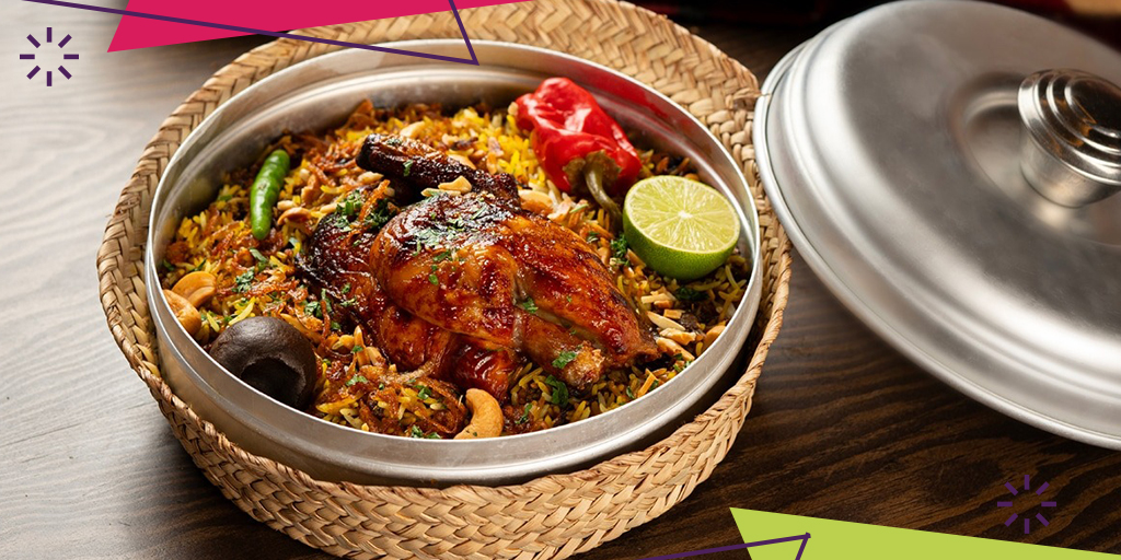
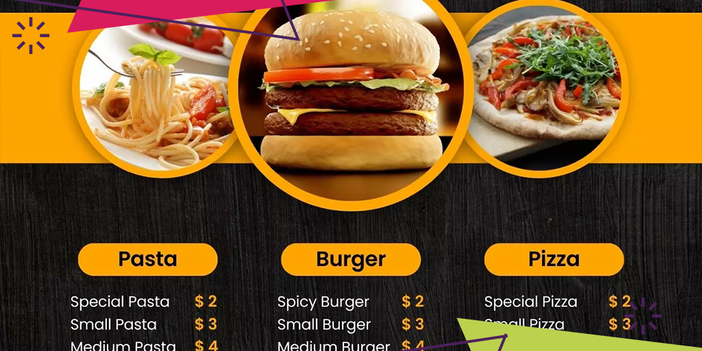
The way you will be presenting your menu on your website will determine if your customers will place their orders with you. Make sure that your menu is presented in a palatable but professional way. Remember that the way your menu is printed in your menu cards is different in how it looks in your digital presence. Choose your menu photographs well; put those menu photographs that will entice your customer’s appetite. The idea is that upon looking at your menu they will feel hunger. They would want to order to you.
Another tip on your menu presentation put your menu in order starting from your appetizers, main course, side dishes, and desserts. Your beverages must also be presented in order from your sodas, juices, and wines.
Locator app
Let your customers easily know where your locations are. On your website, place a locator app that’s easily seen so your customers know which location is accessible should they prefer to reserve a table and dine in. This is also helpful for your online delivery orders because your nearest branch to your customer’s location is identifiable.
Your next step – online ordering system
After learning some of the things you need to do to make your website generate more orders, what’s next? Tip: list down the above as action items on your next planning session. Consequently, evaluate and discuss this list with your team.
Check out how we can help you with all of this!
If your restaurant is looking for an online ordering system

